


Most Shopify merchants turn to split testing when their store traffic grows, but conversions don’t. If you’re searching for practical split testing examples, it’s likely because you need clarity on what to test and what actually moves revenue, not just clicks.
The truth is, many stores waste time on guesses instead of running focused experiments backed by real user data. In this guide, you’ll learn proven test ideas, why they work, and how to apply them to your own Shopify pages for quick, measurable CRO wins.
What Is Split Testing and Why It Matters for Shopify CRO
Split testing gives you a structured way to understand what influences shopper behavior instead of guessing or copying competitors. For stores managing tight margins or rising acquisition costs, knowing what to change and why it works becomes one of the most reliable paths to improving revenue.
Quick Definition for Beginners
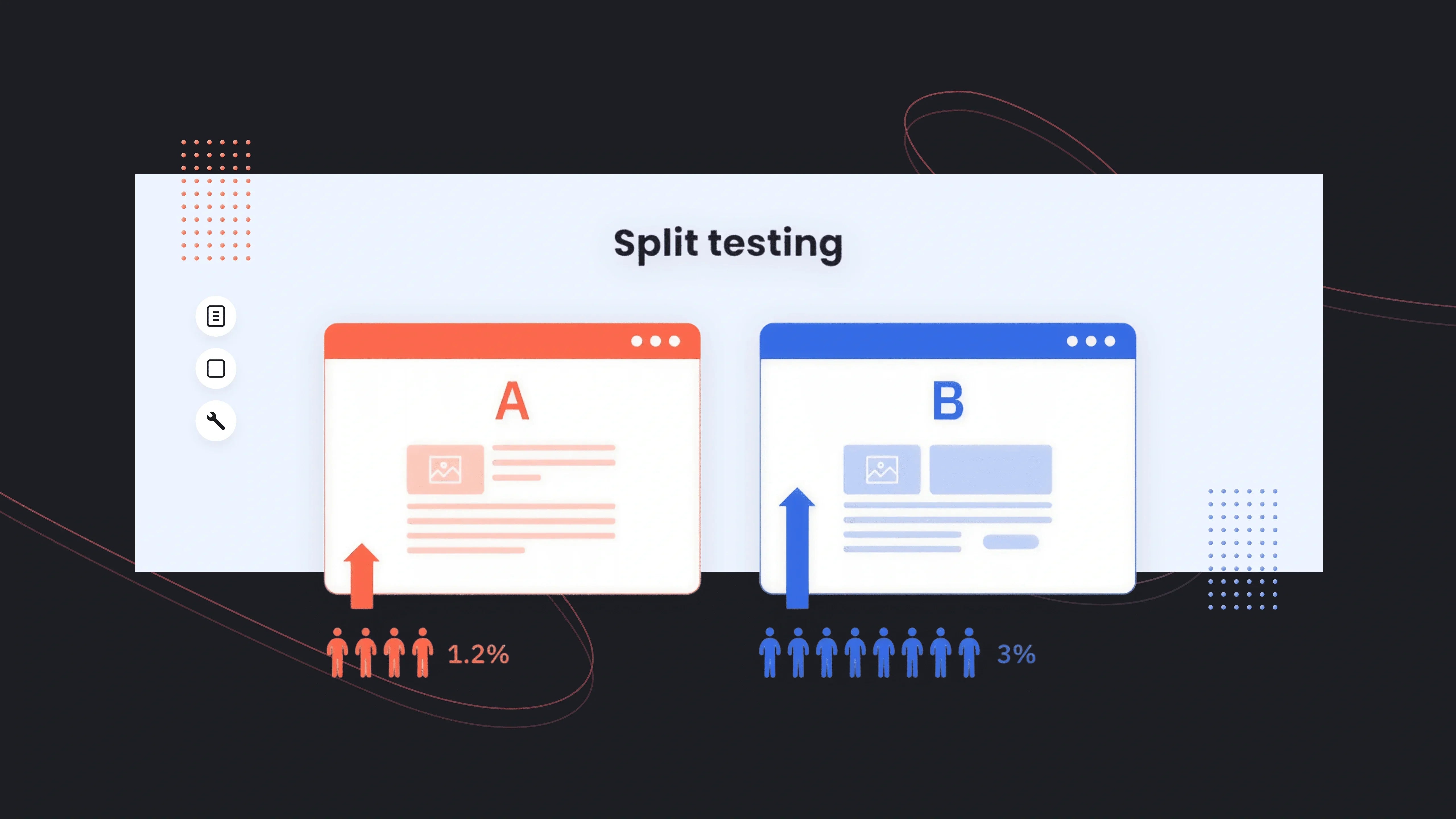
Split testing (or A/B testing) compares two versions of a page, section, or UI element to identify which performs better. Version A is your current design; Version B is the new variation you want to evaluate. Shopify merchants typically test things like headlines, product images, CTA buttons, product page layouts, and promotional banners.
The goal is simple: show different versions to different visitors and measure which drives higher conversions, clicks, or revenue.
Why Split Testing Works for eCommerce
Split testing matters because shoppers behave unpredictably. What you assume will convert often does not. In fact, Baymard Institute reports that 69.8% of online carts are abandoned, and many of the issues, such as confusing layouts, unclear value propositions, and weak product pages, are fixable through structured experimentation.
From experience working with Shopify merchants, the biggest lifts often come from small, focused changes:
- Simplifying product descriptions
- Improving hero messaging
- Making the Add-to-Cart button more prominent
- Reordering sections to match how people actually browse
Even modest improvements compound. Shopify’s own Commerce Trends data shows that a 1-2% lift in conversion rate can meaningfully offset rising ad costs, especially for DTC brands using paid acquisition.
A helpful visual here would be a simple bar chart comparing “Control CR%” vs. “Variant CR%” to show how small lifts contribute to meaningful revenue gains.
Common Misconceptions & Pitfalls
Many merchants hesitate to run tests because they believe they “don’t have enough traffic” or that A/B testing is only for large brands. The reality is:
- You don’t need massive volume, just enough sessions per variant to get directional clarity.
- You shouldn’t test everything at once; prioritize high-impact areas such as hero sections, product pages, or cart flows.
- You must let tests run long enough to reach significance; stopping early often leads to misleading “wins.”
Another misconception is assuming that a single winning test applies universally. In CRO work, context matters. What works for a beauty brand with high repeat purchases may not work for a home décor store with higher ticket values. Real data, not assumptions, should guide decisions.

How to Choose What to Split Test
Running split tests is only useful if you focus on the right things. Many Shopify merchants test whatever feels interesting, like button colors, small UI tweaks, or random copy changes, and see no impact. A structured prioritization framework helps you pick experiments that actually influence buying decisions, especially when traffic or testing time is limited.
What Data You Need Before Testing
Prioritization works best when it’s driven by actual user behavior, not guesses. Before choosing a test, review:
- Heatmaps and scroll depth to see what shoppers notice or ignore
- GA4 or Shopify Analytics to identify drop-off points
- GemX Path Analysis to understand where customers abandon the funnel
- Session recordings to uncover friction or confusion
These insights reveal which pages matter most. For instance, if 80% of mobile users bounce before reaching product reviews, a test to reposition or surface reviews earlier becomes more valuable than running a CTA color experiment.
From experience, merchants who review even basic analytics before testing achieve faster wins because their variations address real friction.
When You Should NOT Run a Test
Not every situation is right for A/B testing. If your store has fewer than a few hundred sessions per variant per week, results may be too noisy to trust. Running tests during large promotions can also distort performance because traffic patterns and buyer urgency shift dramatically.
Avoid testing when:
- You’re fixing obvious UX issues (broken buttons, inconsistent pricing, missing images)
- You recently changed multiple elements at once
- You don’t have a clear hypothesis
- Your traffic is too low to sustain two versions
A common mistake new Shopify merchants make is testing cosmetic changes too early. In reality, foundational elements should be validated first. Once those stabilize, micro-experiments become more meaningful.
15+ High-Impact Split Testing Examples for Shopify
Instead of struggling with generating ideas, most Shopify merchants deal with knowing which experiments will actually move revenue. The examples below focus on changes that consistently deliver measurable lifts across different industries, price points, and acquisition models.
Homepage Split Tests
1. Hero Headline Value Proposition
Your hero headline is often the first (and sometimes only) message shoppers read. Testing a concise, value-focused headline vs. a feature-heavy one can dramatically change perception.
Examples to test:
- “Refresh your day with green matcha goodness and natural vitality”
- “Comfort-first activewear with 30-day free returns”

In practice, merchants often see stronger results when the headline clarifies what makes the brand different, not just what the product is.
Learn more: How to Iterate Value Proposition Copy for Higher Conversion
2. CTA Button Copy or Color
This classic test still matters because your primary CTA directs users deeper into the store. You can test:
- “Shop Bestsellers” vs. “Start Your Order”
- Dark vs. high-contrast CTA color
- CTA placement (above-the-fold vs. mid-page)

From real client data, CTA copy that reduces friction (“Shop Bestsellers”) often outperforms broader prompts (“Explore Now”), especially on mobile.
Learn more: GemX Use Case Series: A/B Test the Homepage CTA
3. Featured Collection Order
Rearranging which collection customers see first can influence both click-through and revenue per session. Many Shopify brands default to “New Arrivals,” but tests often reveal that “Bestsellers” or “Seasonal Picks” generate more qualified engagement.
This test works exceptionally well for stores with a large catalog or seasonal buying cycles, such as apparel, beauty, or home goods.
Product Page Split Tests
4. Short vs. Long Product Descriptions
Some audiences want quick, scannable text. Others convert better when given detailed information. A/B testing these formats helps you adapt to your niche.

Hints from Baymard research: 42% of shoppers feel product pages lack enough detail, especially for items with sizing, materials, scents, or technical specs.
Trying two description structures, minimal vs. expanded, to help you uncover what your buyers truly need to feel confident.
5. FAQ Placement (Above the Fold vs. Below)
Many merchants bury FAQs at the bottom, assuming shoppers scroll. They often don’t. Testing FAQ placement higher on the page can reduce hesitation about shipping, materials, or returns.
We’ve seen this test deliver meaningful results for high-ticket categories and products requiring extra education (mattresses, supplements, rugs).
Learn more: A/B Test Above-the-Fold FAQs vs. Default FAQs
6. Image Gallery Layout (Carousel vs. Grid)
Some shoppers interact better with a scrollable carousel. Others prefer a thumbnail grid to see everything at once.
Test differences like:
- Full-width carousel
- Static grid
- Large hero image + thumbnails

In fashion and accessories, showing more images at once often improves interaction. In tech or luxury goods, carousels tend to keep users focused on key details.
7. Trust Badge Placement
Testing trust badge visibility, especially near the Add to Cart button, can help reduce site abandonment. It matters most for first-time buyers or stores with higher price sensitivity.
Common comparisons:
- Beneath the price
- Beneath the CTA
- As a sticky badge on mobile
Shopify’s internal benchmarks indicate that trust signals placed near CTAs can reduce hesitation by up to 8–12% depending on the category.
8. Price Anchoring or Compare-at-Price
Price perception tests often outperform cosmetic tests. Trying different ways of framing price—discount percentage vs. before/after price—can reveal which message communicates value more effectively.
Examples:
- “Was $129, Now $89”
- “Save 30% Today”
- “Bundle & Save $40”
This test is especially powerful during promotional periods or when introducing bundles.
Cart & Checkout Split Tests
9. Sticky Add-to-Cart Bar
A sticky bar ensures shoppers always have access to the CTA, even after scrolling deep into the product page. For stores with long content (tutorials, ingredients, reviews), this is a high-value test.

In our experience, mobile sticky ATC bars often deliver the biggest lifts because they reduce scrolling effort.
10. Upsell Placement: Cart Drawer vs. Post-Purchase
Testing where you surface your upsells can significantly change AOV. Cart drawer upsells work better for impulse categories; post-purchase upsells work better for higher-ticket items where customers decide more cautiously.
This test reveals where your audience prefers decision-making—before checkout or after completing their order.
11. Free Shipping Progress Bar
Progress bars convert because they gamify the cart experience. Testing versions with different thresholds or styles can reveal what motivates your audience.
Variations to compare:
- Minimal bar with simple text
- More visual bars with milestone markers
- Lower vs. higher free shipping threshold
Shopify’s Commerce Trends Report shows 66% of users expect free shipping on online orders, making these tests especially impactful.
Landing Page & Funnel Split Tests
12. Landing Page Layout (Short vs. Long Form)
Short pages reduce friction; long pages build trust. Instead of guessing which to use, test both.
Short-form pages tend to win in impulse-buy categories. Long-form pages often win for wellness, electronics, and high-ticket goods where storytelling matters.
13. Social Proof Density (Few Reviews vs. Many)
Some audiences only need one strong testimonial. Others respond better to volume.
Try variants such as:
- 1–2 feature reviews
- A full carousel of 10+ reviews
- Photo-based UGC vs. text reviews

We’ve seen review quantity tests shift conversion rates dramatically, especially when paired with recognizable UGC (User-Generated Content).
14. Lead Magnet Offers
If you run list-building campaigns, test which lead magnet resonates:
- 10% off
- Free shipping
- Free gift with purchase
- “Spin to win” gamified pop-up
For many Shopify brands, free shipping converts better than discounts, especially for returning customers.
Email Capture & Exit-Intent Tests
15. Popup Design & Timing
Popups aren’t new, but testing timing and style can lead to meaningful improvements. Test:
- Trigger at 3 seconds vs. exit intent
- Large image-based pop-up vs. minimalist
- Discount-based vs. value-based copy
In apparel, immediate pop-ups often win. In home goods or tech, exit-intent popups tend to convert more qualified leads.
Learn more: A/B Testing Your Welcome Popup
16. Single-Step vs. Two-Step Email Capture
Two-step popups (CTA → form) often convert better because they create micro-commitments, but performance varies based on product category and user intent.
Examples to test:
- Single-step: Email field + CTA displayed immediately
- Two-step: “Unlock 10% Off” button → then email form
- Two-step with benefit-first copy: “Get Early Access to New Drops” → form
In our experience, two-step flows frequently win for fashion, beauty, and lifestyle brands because shoppers feel less pressure upfront.
17. Incentive Type: Discount vs. Non-Discount Offer
Not every audience responds to discounts. Some prefer deeper value, exclusivity, or convenience. Testing incentive types helps you identify which trigger motivates your customers the most.
Variations to compare:
- Discount: “Get 10% Off Your First Order”
- Free shipping: “Free Shipping on Your First Purchase”
- Exclusive access: “Early Access to New Drops”
- Content-based: “Get Our Skin-Care Starter Guide”

Shopify’s consumer trends consistently show that free shipping can outperform percentage discounts, especially in categories with high repeat purchase potential.
How to Analyze Split Test Results (and Avoid False Wins)
Even the best-designed A/B test is useless if you interpret the results incorrectly. Many Shopify merchants celebrate “wins” that don’t actually impact revenue, or even worse, implement changes based on misleading data. Analyzing your test properly ensures you only roll out variations that create real, consistent improvement across your funnel.
Sample Size and Statistical Significance
Before calling a winner, your test needs enough data to be trustworthy. In simple terms, sample size refers to how many people saw each variant, and statistical significance indicates whether the performance difference is real—not a random spike.
Practical guidelines for Shopify stores:
- Aim for at least a few hundred sessions per variant, depending on traffic and conversion rate.
- Let the test run for at least 7–14 days to capture weekday/weekend behavior.
- Avoid checking results too early; early swings are normal.
Industry benchmark: With typical Shopify conversion rates between 1.3%-3% (Shopify Commerce Trends), tests can produce misleading signals unless both variants reach enough sessions and conversions.
Revenue-Based Metrics vs. Click-Through Rate
Click-through rate (CTR) can be helpful, but it doesn’t tell the whole story. A test variation that increases clicks may not increase purchases, AOV, or profit. This is a common trap—especially for homepage or product page tests.
For meaningful CRO decisions, compare:
- Conversion rate (CVR)
- Average order value (AOV)
- Revenue per visitor (RPV)
- Cart-to-checkout progression
- Final checkout conversion
From real Shopify store work, we’ve seen variants with +12% CTR but flat CVR, which means the change improved engagement but not revenue. Conversely, a variant with a similar CTR but +5% AOV often becomes the true winner.
What to Do After a Winning or Failing Test
A test is just the beginning, not the finish line. A “win” should prompt you to dig deeper:
- Roll out the winning variant to all traffic, but monitor it for several days to confirm performance stability.
- Treat big wins as opportunities for iteration, create Variant C to refine messaging, layout, or imagery.
- Document why the test won, so future optimizations can build on real insight, not guesswork.
If the test fails, that does not mean the idea was bad. It simply means it didn’t solve the primary friction. Many successful tests emerge only after the second or third iteration, especially in categories like beauty, wellness, or apparel, where user motivations vary.
From experience, tests that “fail” often uncover valuable behavioral clues. For example, seeing shoppers ignore a new product badge might reveal they are more motivated by social proof than novelty. That insight becomes the hypothesis for your next experiment.
Why GemX Is the Ideal Choice for Shopify Split Testing
Choosing the right A/B testing tool determines how far you can push your CRO strategy. For brands relying on paid traffic or tight optimization cycles, the testing platform matters just as much as the test itself. That’s where GemX: CRO & A/B Testing app built for Shopify stands out.

1. Template-Level Experiments Across All Key Pages
One of Shopify’s challenges is that themes vary widely in structure, and many testing tools struggle to manipulate templates cleanly. GemX solves this by integrating directly with the theme, allowing you to run controlled experiments on:
- Product pages (PDP)
- Landing pages
- Homepages
- Custom templates
This isn’t limited to cosmetic tweaks. You can test full sections, alternate layouts, new content hierarchies, or entirely redesigned templates, then validate changes that influence real purchase behavior, not just clicks.
Learn more: How to create a Template Experiment in GemX?
2. Multipage Testing for Full-Funnel Insights
Most CRO decisions shouldn’t be restricted to a single page. Shopify buying journeys are multi-step, especially for mobile users. GemX enables multipage experiments, letting you test full funnels such as:
- Homepage → Collection → Product Page
- Landing Page → PDP → Cart Drawer
This helps answer deeper questions:
- Does showcasing social proof earlier increase add-to-cart quality?
- Does a redesigned collection page improve PDP engagement?
- Which landing page sends more high-intent visitors to checkout?
Because GemX measures funnels as one cohesive unit, you see revenue-level impact, not just isolated micro-wins.
3. Experiment Analytics Designed for Fast Decisions
Testing data only works when it’s easy to interpret. GemX surfaces clear, decision-ready metrics without statistical noise. With GemX, you immediately see performance changes in the metrics that matter: conversion rate, revenue per visitor, add-to-cart quality, and engagement patterns.

Learn more: How to create a Multipage Experiment in GemX?
4. Page Analytics for Any Store Page
Not every page is part of an experiment, but almost every page influences conversions. GemX includes Page Analytics, allowing you to monitor:
- Sessions
- Bounce rate
- CTR
- Conversion rate

This lightweight analytic layer helps you spot weak pages early and prioritize them for future tests. For larger stores with multiple templates or seasonal content, this feature uncovers hidden opportunities quickly.
Final thoughts
A successful optimization strategy isn’t built on hunches—it’s built on consistent learning from real user behavior. By understanding what to test, how to prioritize ideas, and how to interpret results, you can make meaningful improvements without redesigning their entire store. The split testing examples give you a practical starting point to uncover what truly drives conversions for your audience.
Explore more GemX resources on testing and analytics to support your next round of experiments.
Frequently Asked Questions
1. What are the best split testing examples for Shopify stores?
High-performing tests include hero headline variations, product image layouts, FAQ placement on PDPs, sticky add-to-cart bars, and different lead-capture popups. These tests consistently influence engagement, cart starts, and final conversions across most ecommerce categories.
2. How do I know which split test to run first on my Shopify store?
Start with high-impact areas like your homepage hero, product pages, and cart flow. Use data from analytics, heatmaps, and funnel reports to identify friction points, then choose tests that directly address user behavior rather than cosmetic changes.
3. How long should a split test run before declaring a winner?
Most Shopify stores should run tests for 7–14 days to capture enough traffic and behavioral variation. Wait until both variants reach a meaningful sample size and stable performance before calling a winner. Early spikes often lead to false conclusions.
4. Do I need a lot of traffic to run effective split tests?
Higher traffic helps, but you can still gather directional insights with moderate volume. Focus on key templates with the most visits and run simpler tests that require fewer conversions. Funnel-level tests can also reveal meaningful differences even with lower traffic.


