


- What Makes an A/B Test Successful? (Before We Jump Into Examples)
- A/B Test Examples for Product Pages (The Highest-Impact Area)
- A/B Test Examples for Shopify Homepages
- A/B Test Examples for Landing Pages
- A/B Test Examples for Mobile UX (Critical for Shopify)
- How to Prioritize Which A/B Tests to Run First
- GemX – CRO & A/B Testing Built for Shopify
- Conclusion
- Frequently Asked Questions
Many Shopify merchants know they should be testing, but most struggle with where to start or, worse, run tests that never produce clear results. Maybe your product pages get clicks but not carts, or your landing pages look polished yet fail to move shoppers deeper into the funnel.
A/B testing gives you clarity by showing which version actually drives more actions, not just what “looks better.” In this guide, you’ll find practical, data-backed experiment ideas you can apply right away to improve conversions and make every change on your store more intentional.
What Makes an A/B Test Successful? (Before We Jump Into Examples)
Before looking at real A/B testing examples, it’s important to understand what separates a winning experiment from one that leads to confusion or wasted time. A successful A/B test protects you from false wins and helps you make confident decisions backed by actual data.
A successful A/B test starts with a clear hypothesis built around a real issue you can observe in your data.
Without this foundation, merchants often test random elements (button colors, headlines, and layout tweaks) without knowing what problem they’re trying to solve.
For example, a Shopify store might see strong product page traffic but a low add-to-cart rate after switching to a new theme. Instead of guessing, a hypothesis like “If we simplify the buy box, it will reduce friction and increase ATC rate” gives the experiment direction and purpose.
A solid hypothesis should include:
- Problem: What isn’t working
- Change: The specific adjustment
- Expected outcome: What you think will improve
- Metric: Conversion, ATC rate, clicks, revenue
Example: “We believe that adding lifestyle images as the first photo will increase product page engagement because shoppers rely heavily on visual context.”
This simple structure ensures you’re testing what matters, not just what’s easy to change.

A/B Test Examples for Product Pages (The Highest-Impact Area)
Product pages are where shoppers decide whether they trust your product enough to move forward, so even small improvements can create big gains. These tests consistently produce meaningful lifts across Shopify stores.
1. Product Title Format Test
Product titles shape first impressions, influence SEO, and help shoppers quickly understand what they’re buying. Merchants often default to long, keyword-stuffed titles because they believe it helps search engines, while shoppers tend to prefer short, descriptive phrasing.
Two variations worth testing:
- Simple title: “GEM PROTEIN”
- Detail-rich title: “GEM PROTEIN Bar – High-Protein Snack for Energy Boost”

Why this matters:
In our experience, minimal titles often improve scannability for mobile shoppers, while longer titles help for products with technical specifications. For high-consideration items (furniture, electronics), long-format titles can increase clarity. For fashion or home décor, shorter usually wins.
2. Product Image Order Test
The first image influences whether shoppers scroll, zoom, or drop off. Product images are the most evaluated page element for online shoppers, especially on mobile, where the gallery takes up most of the screen.
Useful variants to test:
- Variant A: Studio shot first
- Variant B: Lifestyle image first
What we consistently see with merchants:
Lifestyle-first versions often increase engagement for clothing, home décor, beauty, and wellness products, because shoppers can visualize real use. For electronics or accessories, studio-first tends to perform better due to the need for clarity and accuracy.
3. Add-to-Cart Button Placement Test
CTA placement is one of the most impactful PDP components to test because it directly affects conversion behavior. Shopify merchants often ask whether moving the ATC higher or keeping it embedded under product details is better. The answer depends on how your shoppers browse.
Common test setups:
- Above-the-fold ATC (right under the title)
- Traditional placement (below pricing or variant selectors)
- Sticky ATC bar on mobile

Why it works:
Sticky CTAs on mobile often show strong lift because they remove friction in longer pages. We’ve seen stores in apparel and accessories achieve 5–12% increases in ATC rate using a well-designed sticky bar. However, for products requiring explanation (skincare, supplements), too-early CTAs sometimes reduce trust.
This is a classic scenario where GemX Template Testing can eliminate guesswork by allowing ATC placement changes.
4. Benefit Icons vs. Text-Only Highlights
Buyers skim. Benefit icons help speed up scanning and improve comprehension, especially for complex or value-driven products. This test compares whether visual cues outperform plain text.
Two common variations:
- Icon + short label (e.g., “Free Shipping,” “Eco-Friendly,” “2-Year Warranty”)
- Text-only bullet list in the product description
What we see across Shopify stores:
Icon sets tend to work well for categories where reassurance matters: skincare, supplements, electronics, and home products. However, icons must be simple and readable. Overly stylized icons can confuse or distract.
5. Price Anchoring Test
Showing a “Compare at price” or anchoring the product next to a higher price can meaningfully influence perceived value. This is one of the most reliable A/B tests because shoppers react differently to pricing cues depending on category, season, and discount psychology.
Variations to test:
- With ‘Compare at’ price (e.g., $89 → $69)
- Without the ‘Compare at’ price

When this test works well:
- Consumables and beauty products benefit from perceived savings.
- High-end brands sometimes lose trust when the strike-through looks too large.
- Seasonal categories (outdoor, gifting) respond well to discount anchors near peak demand.
A/B Test Examples for Shopify Homepages
The homepage plays a unique role in the Shopify funnel: it’s not always the final decision-maker, but it heavily shapes how shoppers explore your store. Shopify data shows that nearly 29% of shoppers navigate from the homepage to a collection before making a purchase.
Which means the way you structure your hero, content modules, and CTAs influences how effectively you guide people deeper into the site. Below are homepage experiments that consistently reveal meaningful wins across real stores.
6. Above-the-Fold Hero Test
The hero is your first opportunity to communicate value, and even small adjustments can change how visitors interpret your brand. A/B testing different above-the-fold layouts gives you fast insight into what message or visual direction resonates best.
Common variants:
- Version A: Minimal hero with one product shot and a single CTA
- Version B: Feature-focused hero with a short headline and subtext
What we see in practice:
Lifestyle-first heroes often improve engagement for apparel, beauty, and home brands, while straightforward product-focused heroes perform better for tech accessories or niche gadgets.
7. Homepage Layout Flow
The order of content blocks on the homepage influences how shoppers browse. Some audiences want a short path to products, while others appreciate storytelling or brand reassurance before exploring.
Potential layouts to test:
- Product-first flow: Hero → Featured products → Collection grid → Reviews
- Category-first flow: Hero → Collections → Value props → Products
- Story-first flow: Hero → Brand mission → Benefits → Products
Examples from real merchants:
Brands with high product variety (e.g., home goods, pet supplies) see better results when placing collections above featured products. Meanwhile, premium brands sometimes perform best with a short brand story or value-stack before showing any merchandise.
8. Collection Highlights vs. Featured Products
This test helps you figure out whether shoppers want breadth (categories) or immediacy (products) when they land on your store. It’s especially useful for merchants with a large catalog.
Variant examples:
- Collection grid first (easier navigation for broad stores)
- Featured product carousel first (better for smaller stores or hero SKUs)
Patterns we often observe:
Stores with a strong hero product, such as a best-selling cosmetic item or a flagship gadget, usually see better clicks when that product is featured prominently. Stores with 10+ categories tend to convert better when collections sit near the top, helping shoppers self-select quickly.
9. Social Proof Placement Test
Homepage social proof can take many forms (i.e., star ratings, testimonials, user-generated content, press mentions, etc.), and where you place it makes a measurable difference.
Two versions to consider:
- High social proof placement: Above or just below the hero
- Lower placement: Near the bottom, supporting buyers who scroll deep

Real-store insights:
High placement often drives improvements for emerging brands because it builds immediate trust. Established brands sometimes do better with a mid-page cluster instead, allowing the products to speak first while social proof reinforces the decision later.
10. Animation vs. Static Content Test
Animations and micro-interactions can either enhance your homepage or slow it down. Testing whether motion helps or hurts your browsing experience is especially important for mobile-first stores.
Variations include:
- Static hero + static content
- Subtle animation (fade-in, slide-up, parallax)
- Bold motion (video background, autoplay clips)
What we see repeatedly:
Subtle animation tends to work best because it improves perceived polish without adding load time. Shopify’s performance recommendations warn that heavy motion or large video backgrounds may increase bounce rate, especially on mobile connections. Stores that rely on paid ads often see stronger results from lightweight animation that keeps the page fast.
For brands in fashion, cosmetics, or lifestyle verticals, a short product-use clip embedded below the fold often performs better than a full autoplay video hero.
A/B Test Examples for Landing Pages
Landing pages work differently from your homepage or product pages. They’re designed for one goal, one audience segment, and one campaign. Because traffic from ads and email tends to be more expensive and more targeted, even small lifts here can create significant ROI.
11. Long-Form vs. Short-Form Landing Page
When running paid campaigns, the right page length depends heavily on product complexity and how “aware” the visitor is when they arrive. A/B testing long vs. short formats helps you see what level of information builds confidence without overwhelming readers.
Variations to test:
- Short-form: Hero → Benefits → CTA
- Long-form: Hero → Story → Comparison table → Testimonials → CTA
- Hybrid: Short hero with deeper sections collapsed by default
What we see across Shopify stores:
Long-form tends to convert better for high-consideration products like supplements, electronics, and premium apparel. Short-form is more effective for impulse purchases or when the landing page is tied to a promotion.
12. CTA Button Copy Test
A CTA on a dedicated landing page isn’t just a button; it’s the bridge between attention and commitment. Testing CTA wording can uncover big improvements because landing-page traffic usually has clear intent.
Examples of test-worthy variants:
- “Shop Now”
- “Get Yours Today”
- “Claim My Offer”

What merchants often overlook:
The CTA that works on product pages doesn’t always work on landing pages. Visitors coming from ads may respond better to value-driven language (“Claim My Offer”), while email traffic often prefers action-driven language (“Get Yours Today”).
13. Value Prop Positioning
Landing pages should deliver value quickly, but the order of those value props changes the emotional tone of the page. Testing the sequencing helps you uncover what motivates your specific audience.
Variations to test:
- Pain-first: “Tired of rugs that shed and stain easily?”
- Feature-first: “Crafted with reinforced wool fibers.”
- Outcome-first: “Enjoy a home that stays cleaner, longer.”
Real-store insight:
Pain-first often wins for problem-solving products (skincare, cleaning tools, fitness accessories). Outcome-first tends to work best in home décor or fashion, where shoppers are motivated by aspiration rather than frustration.
14. Offer Structure Test
Landing pages tied to promotions need testing just as much as evergreen ones. The structure of the offer—not just the percentage—can dramatically shift how users respond.
Variants worth testing:
- Free shipping vs. 10–15% off
- Buy 2 Get 1 Free vs. flat discount
- Limited-time countdown vs. no timer
- Tiered discount (e.g., “Buy more, save more”)

Insights from real campaigns:
Tiered offers often increase AOV for beauty and accessories brands. Free shipping can outperform percentage-based discounts for home goods because it removes uncertainty at checkout.
Shopify reported during BFCM that discounts paired with low-friction shipping incentives drive up to 3.5x higher conversion, which makes this test especially valuable in seasonal periods.
15. Testimonials Type Test
Social proof is a major driver of landing-page performance, but not all types of testimonials resonate equally. A/B testing lets you understand which format builds the most trust for your audience.
Testable formats:
- Video review vs. photo testimonial
- Press mentions vs. star ratings
- Carousel vs. single featured review
Real-world behavior:
Video reviews often win for wellness and personal care products because shoppers want to see real results. Press mentions tend to work best on landing pages for premium or design-focused brands. We’ve seen merchants increase conversion rate by 6–12% simply by switching from a static review block to a rotating carousel of high-credibility reviews.
A/B Test Examples for Mobile UX (Critical for Shopify)
Most Shopify stores now see 70–85% of their traffic coming from mobile, according to Shopify’s latest commerce trends. That means a mobile A/B test doesn’t just “improve the experience”—it directly impacts revenue.
Mobile shoppers behave differently from desktop users: they skim faster, rely heavily on visuals, and are more sensitive to speed or layout friction. These A/B tests help you uncover what actually improves mobile conversions instead of assuming desktop behavior will translate.
16. Mobile Menu Layout Test
Navigation on mobile is a balancing act. If your menu is too deep, shoppers get lost. If it’s too simple, they can’t find what they’re looking for. Testing different menu structures can reveal the sweet spot for your audience.
Variants merchants often test:
- Classic hamburger menu with drawers
- Tabbed navigation: Home / Shop / Best Sellers / Cart
- Hybrid: Tabs for key actions + a full menu tucked away
Real-store insight:
Brands with many categories (beauty, home goods) typically see better results with a tabbed layout because it reduces friction. Meanwhile, single-product or hero-SKU stores often benefit from a simple hamburger menu because buyers don’t need deep navigation.
17. Product Grid Density Test
On mobile, your product grid determines how quickly shoppers scan your offerings. The main question: do users browse better with bigger images or with more products in view?
Variations to test:
- Two-column grid (smaller thumbnails, more items on screen)
- Single-column grid (bigger images, fewer products visible)
- Mixed density: two-column above, single-column after scrolling
Performance patterns we see:
Two-column grids typically increase browsing speed for low-ticket items like accessories or home décor. Single-column grids usually win for high-detail categories where shoppers want a clearer look—think jewelry, shoes, or artistic products.
Adding product badges (Sale, New, Best Seller) often interacts strongly with this test, so consider pairing both changes in sequential experiments.
18. Mobile Speed Optimization Test
Mobile conversion drops sharply when load times increase. Google’s retail benchmarks show that each additional second of delay can reduce mobile conversions by 7–20%. A/B testing lighter vs. heavier assets can show how much performance impacts your audience.
Potential tests to run:
- Compressed hero image vs. high-resolution hero
- Lazy-loading multimedia vs. full eager-load
- Reduced animations vs. standard animations
Real merchant example:
After testing image compression on a fashion store, the compressed version produced a 14% improvement in PDP engagement because users reached the buy box faster.
Because Shopify themes differ, this test is especially helpful for stores using many lifestyle photos or embedded videos.
19. Sticky Checkout Button Test
Sticky CTAs on mobile often act as “training wheels” that help shoppers commit without hunting for the next step. The question is whether your audience prefers having this option constantly visible or whether it feels too aggressive.
Variants to try:
- Sticky ATC on product pages
- Sticky checkout button in the cart drawer
- Sticky footer bar with dynamic content (price, variant, CTA)

Insights from real stores:
For fashion and home décor stores, sticky CTAs usually lead to higher ATC rates because pages tend to be long with many images. However, for luxury brands or stores where education is key, constant CTAs can feel pushy and reduce trust.
GemX makes this test easy because you can modify CTA visibility and sticky behavior at the template level without editing theme code.
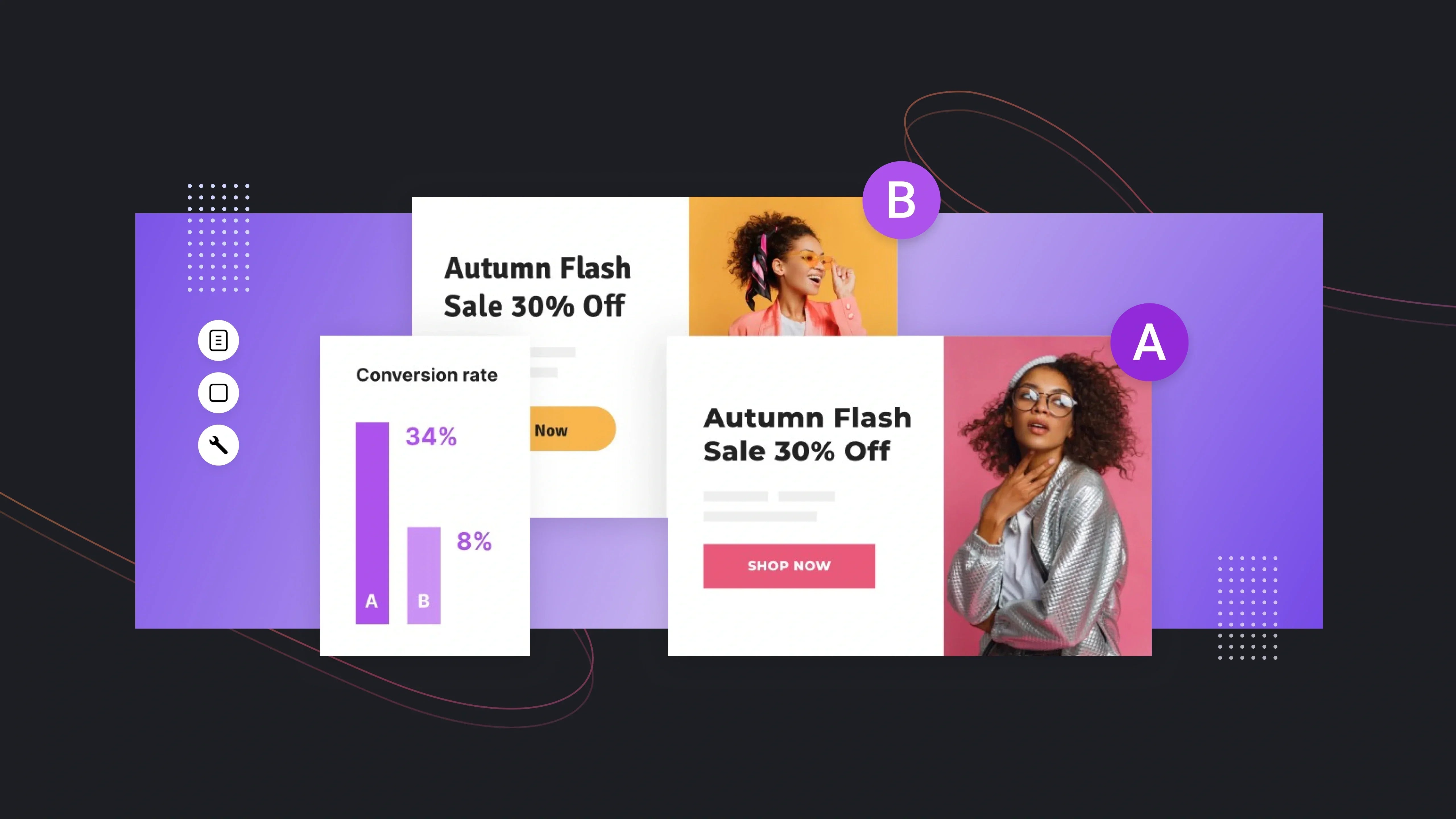
How to Prioritize Which A/B Tests to Run First
With so many A/B testing ideas available, the biggest challenge for Shopify merchants isn’t creativity—it’s knowing where to start. Running random tests leads to dilution, slow learning cycles, and wasted traffic. Prioritizing your experiments ensures you’re spending your time on changes that actually move conversions, not cosmetic tweaks.
ICE/CIE Score Framework
The ICE (Impact, Confidence, Ease) or CIE (Confidence, Impact, Effort) scoring system is one of the simplest ways to organize your testing roadmap. It helps you decide which experiments should run first based on potential upside, execution difficulty, and how strongly you believe each test will help fix a real issue.

Source: ProductLift
How scoring works:
- Impact: How much revenue or conversion potential could this unlock?
- Confidence: Based on your analytics, user feedback, or past tests, how likely is this to work?
- Ease/Effort: How difficult is the test to build, launch, or measure?
Example from a Shopify store:
If you know your add-to-cart rate is consistently low during paid campaigns, testing a sticky mobile ATC bar would score high on Impact and Confidence and medium on Ease. Meanwhile, testing button colors would score low impact and should sit lower in your queue.
Merchants often find that 80% of revenue wins come from 20% of A/B tests, and ICE helps you identify those top-tier opportunities.
Funnel-Based Prioritization
Prioritizing based on the funnel usually leads to the fastest growth. Instead of guessing which page to optimize, you work backward from where shoppers drop off.
This approach uses behavioral data rather than intuition. With GemX Path Analysis, merchants can see the actual sequence of pages customers view and where they abandon.

How funnel prioritization works:
- Identify the largest drop-off point: Maybe 40% of users leave after visiting the collection page.
- Find the resistance: Are filters unclear? Are products too similar? Are thumbnails weak?
- Run tests specifically designed to fix the bottleneck: This might include product grid density tests, filter layout tests, or collection-first homepage layouts.
GemX – CRO & A/B Testing Built for Shopify
At some point in your testing journey, you outgrow guesswork and need a tool built for the realities of Shopify: fast load times, clean rendering, and accurate data across templates and funnels.

GemX was created for that exact purpose. Instead of layering scripts over your store, GemX works at the theme level, giving marketers and founders a reliable way to test everything from page layouts to full customer journeys.
What makes GemX the best choice for Shopify A/B testing?
1. Template-Level Experiments Across All Key Pages
Where many testing tools struggle with Shopify’s theme structure, GemX was built to work with it. That means you can run controlled experiments on:
- Product pages (PDP)
- Landing pages
- Homepages
- Custom templates
Instead of limiting you to small UI tweaks, GemX lets you test full sections, reorganized layouts, alternative content structures, and even entirely redesigned templates.
Learn more: How to create a Template Experiment in GemX?
2. Multipage Testing for End-to-End Journeys
Single-page tests can improve micro-conversions, but funnel tests are where Shopify brands unlock the biggest revenue gains. GemX allows you to test a sequence of pages as one cohesive experience, for example:
Homepage → Collection → Product Page
or
Landing Page → PDP → Cart Drawer
This type of testing helps answer questions such as:
- Does a new collection layout improve the quality of traffic reaching your PDPs?
- Does introducing social proof earlier in the journey increase checkout starts?
- Which landing page creates more qualified add-to-cart visitors?
Because funnels are tested as a unit, you can measure not just page-level wins but revenue-level impact.
3. Experiment Analytics for Clear Decision-Making
A/B testing data shouldn’t require a data scientist to interpret. GemX surfaces the metrics that matter most, and everything is displayed cleanly without statistical noise or hard-to-read charts.

This matters because Shopify merchants often operate in tight learning cycles: weekly campaigns, ad tests, and seasonal pushes. Having results you can trust (and act on quickly) is core to scaling profitably.
Learn more: How to create a Multipage Experiment in GemX?
4. Page Analytics for Every Store Page
Some pages aren’t part of an experiment—but still influence your conversions. GemX Page Analytics helps you monitor the performance of any page with:
- Sessions
- Bounce rate
- Click-through rate
- Conversion rate

This allows you to discover underperforming pages early and treat them as candidates for upcoming tests. For larger stores with many templates or seasonal content, this becomes a lightweight analytics layer that identifies hidden opportunities.
Conclusion
A strong testing program gives Shopify merchants the clarity they need to improve conversions with confidence instead of guesswork. By exploring real A/B testing ideas across product pages, homepages, and full funnels, you now have a practical roadmap for running smarter experiments that actually move revenue. As you apply these A/B testing examples, start small, stay data-driven, and continue learning from how shoppers behave.
If you’d like to go deeper, explore GemX resources to refine your next experiment and keep improving your store experience.
Frequently Asked Questions
1. What is an example of an A/B test for a Shopify store?
A common example is testing two versions of a product page to see which drives more engagement or add-to-cart actions. Merchants often start with simple layout or CTA changes to get fast insights.
2. What should I A/B test first on my Shopify store?
Begin with high-impact areas like product pages, mobile CTAs, or landing pages linked to paid traffic. These touchpoints influence purchase decisions directly, making them ideal for early wins before testing smaller UI elements or brand messaging.
3. How long should an A/B test run for accurate results?
Most tests need 7–14 days to capture weekday and weekend behavior. You should also wait until both variants receive enough traffic and conversions to reach statistical confidence; ending too early increases the chance of misleading results.
4. Do A/B tests affect SEO or organic ranking?
When implemented correctly, A/B tests don’t harm SEO. Keep variations consistent in structure, avoid cloaking, and ensure both versions serve users the same core content. Tools that render variants natively in Shopify, like GemX, help maintain stable performance.
5. Can small Shopify stores with low traffic still run A/B tests?
Yes. Focus on bigger template changes, funnel tests, or high-traffic pages to get reliable data. You can also use behavioral insights from analytics or Path Analysis to prioritize where tests will make the biggest impact, even with modest traffic.
6. What are the best A/B testing examples for boosting conversions?
Strong options include testing hero layouts, image order, buy-box structure, sticky mobile CTAs, landing-page value props, and offer formats. These changes influence shopper decisions quickly and often reveal meaningful lifts across the full purchase funnel.


